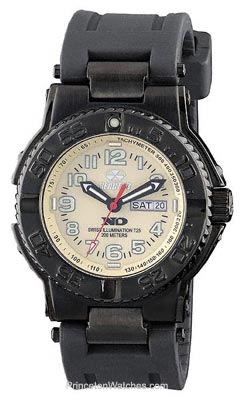
Reactor Tritium & SuperLuminova Watches Miss the Mark by Miles
I recently came across these watches from Reactor. They include the semi-significant innovation of utilizing supplementing SuperLuminova and tritium luminous systems simultaneously, a combination Reactor aptly terms its “NEVER DARK” system.
Most mainstream modern brands brands seem to have considered the technique redundant, but from a practical and reliability standpoint there’s something about the reassurance afforded by redundancy that appeals to me and I thought the tactic to be notable. It is potentially useful, as it perhaps includes the best of both worlds: the short-term brightness of Luminova and the long-duration, “self-charging” properties of a tritium radioisotope capsule system. The system has the potential to produce an especially luminous, legible watch under most any conditions.
And it is perhaps also encouraging as well that the innovation comes from an otherwise all-but-unheard-of brand. I can’t think of any other brand that has tried this, even though Luminova has been on the market since about 1993 or so and tritium since about 1960.
However, this is perhaps one of those all too frequent occasions in the watch world when an otherwise notable innovation seems to fail rather gloriously and mightily right out of the gate, overwhelmed by other shortcomings on the way to becoming a finished product. The execution of the concept in the finished model seems profoundly ill-conceived, so badly so that the innovative tritium/luminova combination is entirely eclipsed by gross stupidity.
So Close and Yet so Very, Very Far Away
Despite the innovative luminous system, this Reactor watch has several endemic problems, so many that I feel somewhat challenged in even trying to list them all and in having to decide on a coherent order in which to present them. So here are some of the problems I think most significant, in no particular order:
- The tachymeter scale on a “three-hand,” non-chronograph watch is all but pointless unless phenomena to be observed happen to occur precisely at :00 every time. Why bother to include it unless you’re just trying to look cool without bothering to provide any actual utility?
- The tachymeter scale is even more pointless on a quartz-controlled watch, in which the second hand steps in discrete 1-second intervals that don’t often coincide with the marks on the tachy scale.
- The second hand doesn’t even reach the already pointless and irrelevant tachy scale, making the ostensible use of it an exercise in visual extrapolation.
- The gap in the outer edge of the case at 9:00 seems to have no visible purpose beyond an ill-conceived attempt to maintain a sense of symmetry with the crown guards. Instead it sticks out like a sore thumb.
- At 13.2mm (0.52″) thickness the watch is especially and impractically thick. This might be forgiven if the water resistance were something more than a rather anemic 200m, but it isn’t. For the sake of comparison, the 42mm Omega Planet Ocean is about 14.5mm thick, but with three times the water resistance (600m) for that paltry extra 1.2mm.
- At 192g, this is a really, really heavy watch. That works out to 6.7 ounces, or about 0.42 pounds — nearly half a pound!. Again, the weight could be forgiven if the WR were something greater than 200m, but it isn’t. Especially irksome is that with a small, lightweight quartz movement much of that weight likely owes to deadweight, nonfunctional case and spacer.
- The goofy lugs mean that you’re stuck with that goofy polymer strap and won’t be able to swap with standard straps or bracelets.
- The “ND” logo on the dial is superfluous and is a distraction in daily use. Its stylization also makes it difficult to discern, so much so that for several minutes I was left thinking, “Why on Earth did they print ‘NO’ on the dial so prominently?” As a rule of design dial text should be kept to an absolute minimum in my opinion; the luminescence should be self-evident.
- Black number markers on a black bezel? Why bother? They’re all but illegible. This might almost be stupider than the pointless tachymeter scale, and that’s saying a lot.
- The $350 pricetag is overreaching for a quartz watch with so many inherent design problems. Comparable tritium-illuminated quartz designs (to which adding luminova would presumably be inexpensive) from established brands like Traser, Luminox etc. start at around $110 or so.
Sometimes you get what you pay for, sometimes you get fooled and get way less than what you pay for. I think I know which side this one comes up on. So… back to the drawing board for you, Reactor. I would be curious to see another attempt (perhaps even by a more experienced brand) as the luminova/tritium idea as it does seem to have more than a little merit on its own if it were executed in more well-thought-out design.


I had a Never Dark and it was always dark. Traded it.